

House2Home
A Solo Google Venture Design Sprint
House2Home is an E-commerce website that sells home decor items and accessories like prints, framed photos, lighting, small home accent pieces, and accessories. The website is targeted at people who have just moved into a new home or apartment. Users want to buy new items to customize their place, but they don’t feel comfortable buying new products independently. House2Home provides a starter kit of multiple products with different style choices to help them achieve a well-put-together look.
My Role
UX Researcher
UX Writer
UX Designer
UI Designer
UX Strategist
Platforms
Desktop
Project overview
Conduct a design audit of the current state of the House2Home website and deliver recommendations
Deliverables
Competitor Research
Brand Identity
Logo Design
Evaluation of Pain Points and User Needs
An interactive prototype made with Sketch
User testing report and iterations
My Role Details
This case study covers my first Google Venture Design Sprint. My role is to use design thinking methodology to do a design audit of a fictional existing e-commerce store. I set out to understand the problem, research, empathize with users, design, test, and validate a user-centric website prototype.
Constraints
Website for desktop
Needs to help users quickly decorate a new home they have just moved into
Most products are priced between $15-$50
Can not sell large pieces of furniture
Empathize
What Users Are Saying
House2Home provided user research and interviews for me to evaluate. I wanted to get an in-depth view of user needs are and find paint points.
“I find a lot of cool little items that I like but I never know if they’ll all look good together. Usually, I get overwhelmed and end up not buying anything. “ -Dan
“I moved into a new apartment and it was sooooo empty. So I wanted to buy some stuff to make it a little more stylish. I knew I needed a few things but it was hard to stick to a budget.” -Maria
“I know the “look “ I want and how I feel when I walk in. I just don’t know what products to buy to pull it off. “ -Deena
Need
Dan wants to make sure the products he buys look good all together in his space.
Need
Maria wanted to stick to her budget.
Need
Deena knows the looks she is going for but needs help finding the pieces to pull it together.
Pain Points
Has a problem sticking to a budget
Spends too much time searching for products
Has a hard time finding matching pieces
Is not sure of specific styles that fit a look
Needs smaller pieces to move easily
Doesn’t want to spend too much on fewer pieces
User Needs
Help to find pieces that go together for a specific look
Pieces that are already put together in matching style
Budget-friendly style choices
Balance quality and quantity under a budget
A variety of pieces that look good in the user’s space
Smaller pieces
Goal
To create a website that will help users find the “look and feel” they are looking for in decorating their new home that works within their budget, saves them time, is stylish, and looks good in their space, all while allowing the flexibility to choose the sizes of the pieces.
Map
I mapped out the red route of the most critical task, finding a design package, choosing the pieces to buy, and purchasing it.
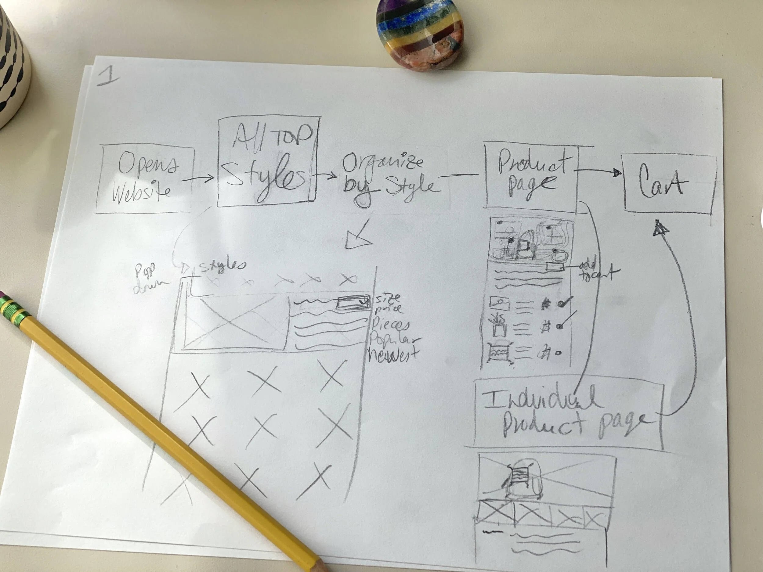
Rough sketch map.
Tasks
Open Website
Top Styles
Product Page
Individual Product Customization
Cart
Purchase Complete
Competitor Analysis
Homepage
I like the simple, minimalist layout Air bnb uses to showcase their rental homes. These examples have a nice clean look that allows excellent photography to show off the product without a lot of cognitive noise. Having a few larger-sized photos per screen, plus plenty of white space, saves users from feeling overwhelmed with choices.

Air bnb

Air bnb
Filters
Three of the five companies I looked into had the product page filters and sorts on the page’s left side with expandable details. I noted this option as a possibility, but I think it is more common when many filters are used because of the vast difference in the options available. I don’t believe House2Home will need a large filter and sort.

Aerie

Wayfair
Crazy 8’s
I had some ideas of layouts that would work, but there were quite a variety of possibilities. Doing the crazy 8’s exercise helped me zero in on 8 possible solutions within 8 minutes. Some variations have slight differences but work better than others. I chose the best one and circled it.

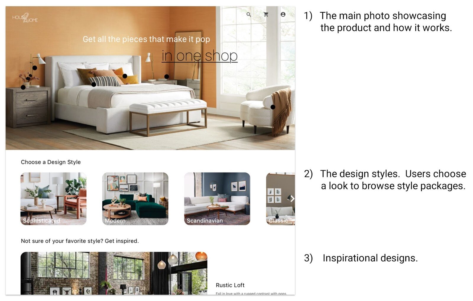
I picked this design because the large home page photo shows off the product while keeping a clean, minimalist look. This design also had what I believed to be a perfect hierarchy for selling the product well. Many users already know what design style they are interested in, so I thought it would be a good idea to organize the design styles by category.
The Design Style carousel directly below the main photo formed the hierarchy well by directing users to the design style category options. The Design Styles show the user the product packages pair together a specific design style to create a look.
Featured design styles are displayed below the design style carousel to inspire users and show off the latest looks.
Solutions Sketch

Home page, Product Page, and Individual Product Page.
I sketched up a solution of the critical screen and two screens after it. I selected this screen because I wanted the photography to show off the product front and center to give the consumer a dramatic feel for the brand when arriving at the site. Setting the hierarchy to have the Design Style options directly below the main photo was essential to lead the user to the design style choices.
Ideate
Storyboard
Next, I put together a storyboard to show how the user interacts with the interface, what results from their interactions, and what the user will do next.

Having an individual product page (step 5) allows the user to look closely at each product’s details and see the dimensions, colors, and materials. This way, the user can make sure they are happy with the product.
Users need to be able to remove items from a design package. Being able to choose individual products helps with budgeting, personal taste, as well as size restrictions.
Step 1: Google Search ‘Home Decor’
Step 2: Choose a Design Style- Modern
Step 3: Choose a Design Package
Step 4: Click on an individual Item in the Package
Step 5: Remove that item from the Package
Step 7: Review Cart and Complete Purchase
Step 8: Purchase completion
Although you can not see it in this storyboard because it will not be a part of the MVP, between steps 5 and 6 will be an option to use an augmented reality view (AR View) to help users see the product in their own space. This feature will allow the user to be sure they like how the product looks in their own home, which was a concern for some users.
Prototype
Using the storyboard as a guide, I moved forward designing the screens in Sketch. Creating a prototype is good fun, and I enjoyed seeing House2Home come together. It is always exciting to bring your ideas to life. Even though this was a solo design sprint and I was short on time for extras, I still wanted to give the company some identity, so I created a quick House2Home logo.
I got to work on my design plans. I found a photo that inspired me, so I used it for the primary home page photo. The image also inspired the burnt orange, black, grey, and tan color scheme I used throughout the website. I kept it clean and straightforward, focusing on the three main spotlights.
Filters
Filters and sorts need to have an intuitive interface to ensure low cognitive load and ease-of-use. I spent time researching filter layouts that could work well for House2Home, and I am happy with the results. It is simple for users to breeze through without spending a lot of time figuring things out.

Modern Design product page with filter and sort pop-down menu.
Users were concerned with sticking to a budget during research, so adding a price point filter was a no-brainer. The slider is convenient because the price amount changes in the bubble as you slide it, so you don’t have to have numbers on both sides of the number line, creating more information noise.
A Pieces filter gives users the option to choose the number of pieces to buy, narrowing user choices.
I felt it was essential to quickly switch the design styles without having to go back several pages. Having a list with a button is a comfortable, natural navigational design.
Side note, after user prototype testing, I realized I needed to add a filter. One user mentioned preferring to buy only small-sized pieces to make moving easier in the future. I added that filter and called it all pieces under 10x10 inches in diameter, which also benefits those who want to decorate small spaces.
User Options
Giving users the option to keep or remove specific design pieces in a package was essential because they may like a design package, but a particular product may not work for them. Having an individual product page allows the user to see the product up close, see details on materials and sizing, and remove the product if they do not want it.

Individual Product Page

Products Page
As you scroll through the individual product page, you will see it’s a description, color, material, dimensions, and weight.
The Design Package page features every piece you can buy in that package with the choice to purchase each product or remove it.

Click below for the
Test
I found five users to do moderated usability prototype testing through social media and friends. Recording the remote Zoom sessions was conducive because it allowed me to take notes afterward when watching the recordings. For my non-Zoom sessions, I did one remote, moderated test via Facetime, where I took notes on paper. I did the same for one moderated, in-person user test.

Zoom remote, moderated prototype test.

In-person, moderated user testing
I corrected a handful of minor errors discovered during the first few user testing sessions. It is not uncommon for those types of mistakes to pop up due to the transient nature of creating a prototype within the 5-7 hour design sprint. It was important to correct them before the second half of testing to allow the subsequent users to focus on layout and functionality. Doing so served me well, and I was happy with the outcome.
Findings
1) Originally, the Buy button was labeled Buy All. During user testing, some users were uncomfortable clicking Buy All since they had just removed a product from the package they were not going to buy. Even though the checkmark for the removed product was not checked, it felt as if they might be purchasing all of the products anyways. So I changed the label to Buy. I will test the Buy button in the next round of user testing to see how it does.

2) A user suggested adding product reviews to the packages to see how others like the products. Great for release 2. Allowing users to add a photo gallery of the design package they purchased as set up in their own home could also be in the 2nd release.
3) Two testers mentioned there was no sign-in or billing page in the original prototype, so I completed the checkout with a 3 step checkout process. Review order, sign in/sign up, and a billing page.


4) It was unclear to users how to add their promo code. Although there was a promo code line, there was no way to tell where to put it in. I created a darker-colored input box so users could see where to add their code.

5) A user noticed the arrow that shows users the Style Designs continue to the right was missing, so I added one.
7) It was suggested I break up the complete purchase page information to make it easier to read, so I changed it to bullet points.

Conclusion
My first Google Venture Design Sprint went well. The accelerated design process allowed me to forget about perfection and focus on solutions. The pressure of the 8-minute time limit during the Crazy 8’s exercise focused my energy on brainstorming rapidly without allowing me the time to overthink the designs. This helped creativity flow.
I enjoyed going straight from the storyboard to prototyping because I could use the storyboard as my guide and get straight to designing. Thankfully, I didn’t run into any significant time-consuming problems, although I did need to add two pages for the checkout process in order for users to properly complete the red route.

I added appropriate filters and organized the designs by style type, enabling me to tackle each user need and pain point.
I ended up with a clean, aesthetically pleasing UI that is also user-centric. The layout was planned with a strategic hierarchy to engage users, which will hopefully help optimize conversion.
Users can now use House2Home to decorate their new home in a way that works within their budget, saves them time, and looks good in their space.
What’s Next?
Moving forward, I plan to do another round of user testing to test the Buy button to make sure it doesn't confuse users when purchasing.

Once the MVP is complete, I will work on the second release features.
Product review
A place to upload photos of the products in users' homes
An AR View feature on the individual product page allows users to see how the product looks in their homes.
Photos Credits for photo’s used in the app design: Pottery Barn, Arhaus, Interior Define

