willow & co.
House plant E-commerce store easing the fears of buying plants online
Willow and Co. is a fictional houseplant E-Commerce company lacking conversion in the browse-to-checkout process. As a result, the company is looking to gain higher rates of purchase completion and increase revenue.
Deliverables
Name and Logo Design
Brand Identity
Competitor analysis
User survey
Design Audit
Sketches & storyboards
High fidelity screens
Interactive prototype
User testing
An interactive prototype made with Sketch
User testing of prototype
Project overview
Conduct a design audit of the current state of Willow & Co. website and deliver recommendations
90 hours to deliver
Platforms
Desktop
Problem
Data shows that 50% of users open an average of 7-page items and then abandon the site without moving any items into the cart. House plants have a large variety of varying characteristics, so in this case, it is suspected that users cannot determine which houseplant is best for their space.
Additionally, 70% of users abandon the cart at the registration page, which is likely due to not having a guest checkout option.
Objective
To find solutions to the browse-to-checkout process that drive up conversion rates through a redesign by:
Adding a guest checkout
Allow users a way to compare products quickly, easily, and intuitively
Add features to improve engagement and increase the purchase completion rate
My Role Details
As the UX/UI designer, my role is to redesign the website’s browse-to-checkout process. I will analyze the current data, do a design audit, create a new name, logo, and brand identity, conduct competitor research, determine successful layouts and features, implement the re-design, and test it to help the website increase its conversion rate.
Research
Competitor Analysis
I examined 3 of the top-selling house plant e-commerce stores, The Sill, Bloomscape, and Amazon, to look at their browse-to-completion checkout process. I went through each flow, looking at what worked well with their layout and features that might help users filter products during browsing. I also noted every component that might support checkout completion.
Bloomscape has an extensive filter with tons of options. Having “NEW” labels on product pictures draws attention to new products and catches the users’ eye. I also noted refer-a-friend discounts are a great purchase incentive.

Both The Sill and Bloomscape include beautiful social media-powered customer product photo feeds. Doing this allows consumers to see customers enjoying and engaging with their products. In addition, it will enable them to see the products being used in real life, making them relatable.
Amazon, The Sill, and Bloomscape have at least two product suggestion upsell features throughout the browse-to-checkout process.

Top The Sill, Bottom Bloomscape.
Amazon has a Discover Additional Products feature on the cart review pop-up page, which can be helpful to entice users to add more products to their order by showing them add-ons they may need.
Compare
I realized I needed to see all the information I had gathered in one spot, so I put together a competitor analysis chart to compare side-by-side. Then, I decided which features I wanted to add to the Willow & Co. redesign to get results. I will go into further detail on why I choose those features as I go on.

Chart Highlights:
Amazon was the only company that offered Favorites and a Save for Later
Express Checkout is available by all three companies
Payment Plans can be helpful for more significant purchase amounts
Workshops are a great way to engage the community
The Sill and Bloomscape offer a subscribe discount
Empathy
Competitor analysis is a great way to get a step up on the competition and put together effective methods and features. However, being in UX, it is just as important to get user feedback to narrow in on the user needs.
User Feedback Survey
I found house plant enthusiasts groups on Facebook to be a great place to find consumers passionate about house plants. So I made a user survey in google forms and posted it to the groups to get into the consumer’s minds. I received about 30 responses.
Some of the questions I wanted to know:
Do users use sorts and filters to narrow down their searches?
Would users find a Favorite button, save for later, or list features valuable?
Do users have a hard time knowing which product suits their needs?
Would users like an added feature that allowed them to compare product by feature in an easy-to-read chart?
Survey Results
46% of users said it was challenging to know which plant best suits their needs
74% of users said they would use sorts and filters to narrow down their choices
96% of users said they would be interested in a feature that allows them to save plants to a list or favorite them for future purchasing
Over 70% said they would find a plant comparison feature helpful
32.3% of users have not purchased plants online before

Pain Point Highlights
It’s important to note that over 30% of users had not bought plants online. That is a large percent, so I wanted to dive deeper into this. Below is a quote from the survey.
I don't buy plants online because I can't see the soil or the true condition of the plant.
-Survey Answer from Janessa L.
According to my survey, here are the top 5 reasons the surveyors were not interested in buying plants online.

I realized there were a few things I could implement to Willow & Co.’s website to tackle this problem, but I wanted to make sure that I had all the information before I made any decisions.
After I finished going through the survey results, I put together the top pain points and determined user needs.
Pain Points
Doesn’t want to commit to making an account to purchase
Doesn’t want to pay for shipping
Doesn’t want to wait for shipping
Afraid the plants will not arrive safely
Can’t see the actual plant they are purchasing
No way to save products to buy later
User Needs
Find the plant that works best for their space
Help to narrow down options
Clearly know each plant characteristics
Know plants will arrive in good condition
To save plants like for later purchase
A place to learn about plants
I didn’t want to deviate too far from my main goal of getting completed checkouts and making browsing effortless, but I needed to figure this purchase dilemma if I wanted to be successful. Fully understanding what was hindering users from buying house plants online is essential to improve the conversion rate. I kept that in mind while I examined all the information I gathered up to this point.
Synthesis
Redesign Plan
First, I want to design a simple filter process to help users find what they need quickly and easily. Next, I need to add features that would allow users to feel confident in their purchases to minimize abandoned carts. Lastly, I needed a guest checkout that was seamless and intuitive.
Add a Filter and Sort to narrow down results to help users know and find what they need
Create an intuitive Guest Checkout that makes it easy for users to purchase without signing up
Add A Product Feature Comparison chart to make it easier for users to compare the requirements for each plant
Add Product Add-On suggestions in multiple places to bring up purchases
Add Multiple places for users to be able to Subscribe to gain users email
Add a Refer-A-Friend Discount to incentivize users to share
Add an SMS Sign Up with a first-time discount to incentivize users to purchase
Add a social media Customer Product Photo Feature to add a realness to the products and allow users to see products being used by other people
Add an As Seen On section to build trust
Add a Favorites Button to save products for future purchasing
Add Workshops, Blog, and Plant Care Resources to engage users, build interest, and educate users
Ideation
As I prepared to make my design decisions, I started to visualize based on what I learned from my research to conceptualize a prototype solution. First, I needed to know the browse-to-checkout user flow to know what screens need to be designed.
Creating the user flow took some time as I worked through the layout possibilities. I wanted the guest checkout to be intuitive, so users didn’t have to think. They could just buy. Looking at similar competitor flows as examples and seeing what worked well, I put together a browse-to-completion user flow adding in features I had planned to incorporate.

Note: After working through the Product Feature Comparison Chart, I realized it was the same outcome a filter would provide, so although I initially thought it might be helpful, I recognized it wouldn’t be necessary.
And, although the final product will have a “leaving so soon’ pop-up window, I decided it wasn’t necessary to test it in my prototype for the first few rounds of testing, so you will not see it incorporated into this case study.
Sketches
I spent some time doing a quick draft of each page to get an idea of the layout and see what was working and how things fit. Even though it took extra time, I felt it was necessary for my design process because it allowed me to focus on the ideas instead of getting distracted by having nice circles, straight lines, and perfecting the design.
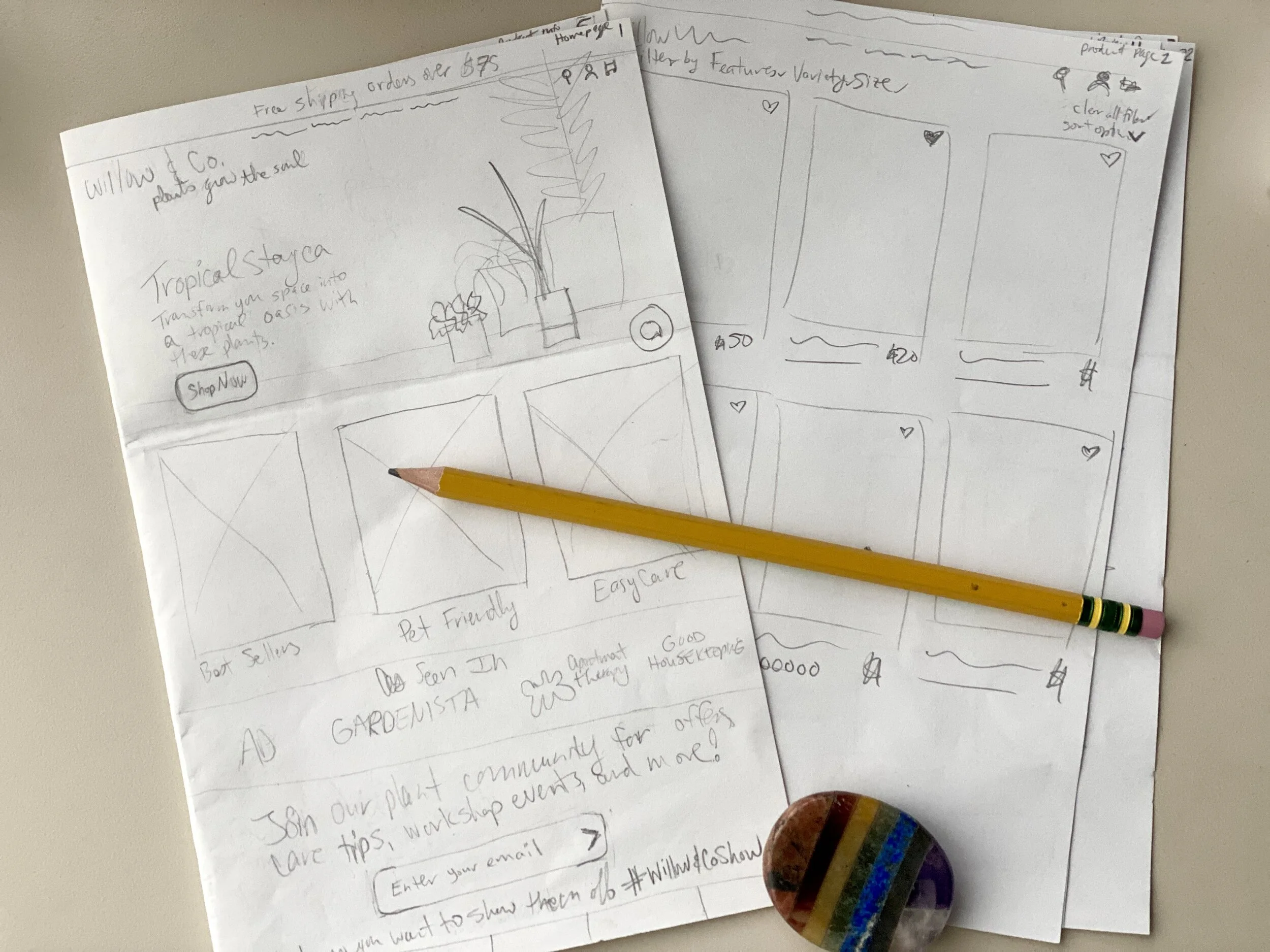
I decided to sketch my designs first to do a preliminary round of user testing to make sure the layout and flow worked. I wanted to be sure before I invested the extra time into creating the high-fidelity wireframes. Surprisingly, the design didn’t change much, and I realized I could have started low-fidelity wireframes and possibly saved time. Going that route is something I will consider in future design projects.
As soon as I completed my drafts and laid everything out, I got to work on the sketches I’d be using for testing my designs.

Willow & Co.’s first browse-to-completion design sketch. See full sketched design here.
Testing
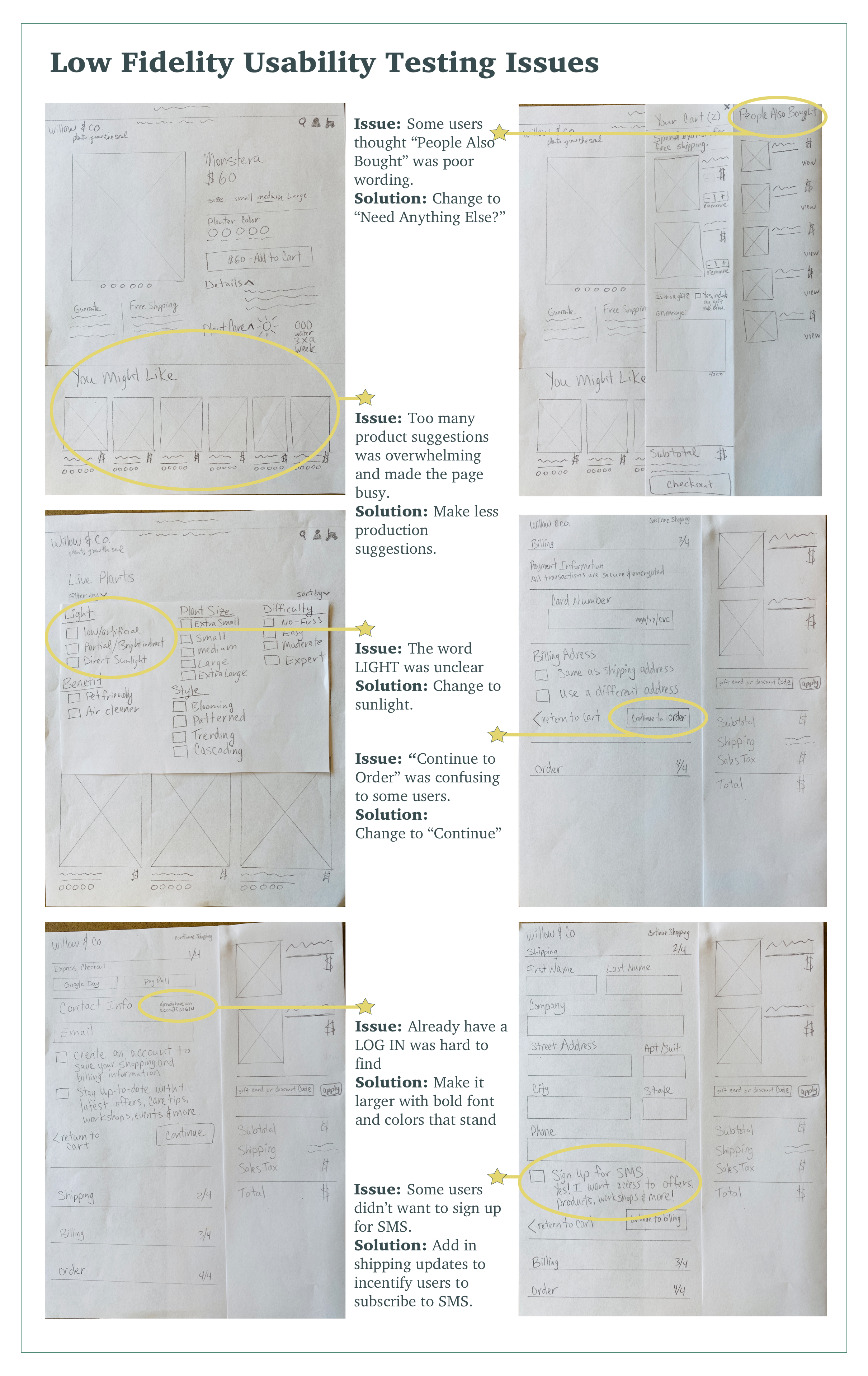
Low Fidelity Usability Testing
I used Zoom to remotely meet with five testers to perform a moderated usability testing session of Willow & Co.’s browse-to-checkout process. I found testers by asking friends and posting on social media plant enthusiast groups to attract users who fall in the target demographic. By using Invision prototyping, users were able to share their screens remotely as they tested the app.

Photo of remote, moderated Zoom session with me and Anna M.
The objective was to test the newly designed layout and function of the browse-to-checkout process and confirm the success of the implemented changes. Through testing, I discovered several user challenges, from minor to major. I used this feedback to determine the iterations needed to ensure the website exhibits an intuitive user experience that meets all my goals.
There was positive feedback from users as they moved through the design, but some issues were brought to light that needed to be addressed.
In regards to, People Also Bought product suggestions on the cart review page Anna says, “ I don’t care what other people bought, I care about what helps me with my buying experience.”
-Anna M. low fidelity usability testing
Iterations
Anna M.’s quote above is a great example showing how important it is to pay attention to the user’s needs. Finding the proper wording can make a world of difference, so as I moved to the high fidelity designs, I changed “People Also Bought” to “Need Anything Else?”. Doing this portrays what is intended and doesn’t sound like a sales pitch or an up-sell. People can appreciate being shown items they need if it’s done well.

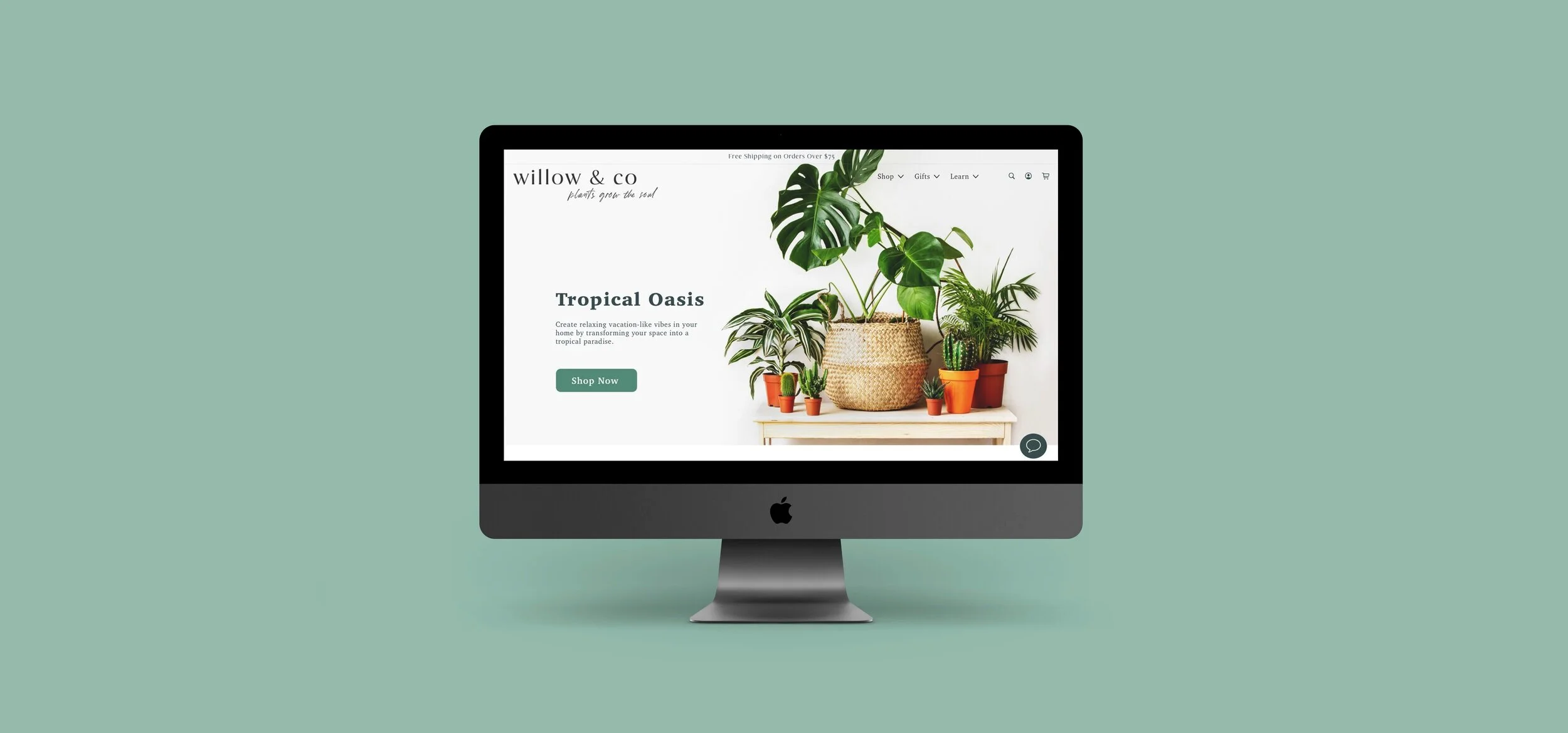
High Fidelity Designs
It is always fun to move on to high-fidelity designs. Collaborating the research, the users’ needs, and the design ideas to create a website is very gratifying.

I got to work creating high-fidelity designs based on my sketches. I incorporated the corrections that were uncovered during the low-fidelity sketch usability testing. I wanted the home page to be clean and minimalistic to focus on the product. I made sure to have large pictures with minimal visual noise and balanced white space.
Features I added to the home page:
As Seen In to create trust
More visible Subscription Signup to make it easier for users to see and join
A Social Media Customer Product Photo Feed to show users the products being used and enjoyed

Filter and Sort
During the sketch usability testing, one issue that came up was that users didn’t notice the Sort drop-down menu. So I decided to try something different and combine the Sort with the Filter to test and see if it worked well. I like this layout because I wouldn’t have to spend time looking for the sort and opening it. So overall, I felt it was more intuitive to have in one spot.
Having the filter and sort as a pop-down menu seemed like the best option as it was easy to spot but didn’t take up much space until it was open.
It is easy to check or uncheck each filter as needed. Being able to check multiple boxes at once and automatically update was essential to a seamless filter process.

Added Features

New Products
As you can see in the photo above, for new products, I made a “new” label with a star that stands out to help users identify what’s new and draw attention to them.
Favorites
I added hearts to the top of each product on the products page so users could Favorite a product that would save to their favorites for future purchases, as seen above.
Drop-Down Information
There was a lot of information for each product that needed to fit in one view. I didn’t want to overwhelm the visitor, so I used pop-down’s for the details. Doing so helped keep the page tidy but also allowed necessary information to be available.
Guarantee
Adding a shipping and product guarantee was essential since I knew many plant lovers were hesitant to purchase plants online.
You Might Like
I added a You Might Like section to educate the user on other products and work on upselling.
Plant Details
Having a feature going into the individual plant details engages consumers, educates them, and can grow their appreciation for plants.
Guest Checkout
One of my main goals was to make sure users complete their purchases, so it was essential for me to have an intuitive guest checkout that worked seamlessly. Below you can see I added multiple checkout options.

4 Ways to Checkout:
Express Checkout offering a speedy purchase with Google or Apple Pay
Guest Checkout adding in your email and press continue
Check the Create an Account box and a pop-down window appears to create the password to complete the account
Click on “already have an account, LOG IN” to log in to that account
High Fidelity Usability Testing
It was time to test out the high-fidelity designs and see how they did. I found five users from the Facebook plant enthusiasts groups and some friends who fell in the target demographic to do remote, moderated, usability tests in Zoom. I choose Zoom because it allowed me to record the sessions so I could go back to refer to them for transcripts.

Screenshot of a Zoom session doing a remote, moderated, usability test with Janel B.
I gathered valuable input from the testers as well as receiving positive feedback. Now it was time to implement the changes.
Filter and Sort

The corrected design including the X to close the filter.
5/5 users said they liked having the sort and filter in one spot, making the process easier.
The problem they ran into was, instinctually, they would go to the X to close the filter, but in this case, it had a “Clear All Filters” button. As you could imagine, it would be frustrating to click the reset filter button. So, I added an X to the right corner to close out the filter window to remedy this issue. This way, users would have a more intuitive second option. You can see the iteration in the photo above.
Shipping Information
A few younger users were uneasy about the Company field. A tester suggested I let people know it was not mandatory, so I added the word “optional” to the line.

What is SMS?
4/5 testers this round were not 100% confident they knew what SMS was. So I decided to change SMS to Text Messaging to make it easier for users to understand.

Payment Confirmation
Initially, I forgot to add a payment confirmation page, so I added one to the high-fidelity design and tested it in the second round of usability tests. One of my users noted it might help her feel more confident that her purchase went through if I put in a few more pieces of information on the confirmation page. For example, reassuring users that their order was received and that they will be receiving an email with tracking information can help them feel at ease. Also, letting users know their plant will be carefully shipped within ten days will help them wait more comfortably.
In addition, using playful plant graphics, an elegant border, and a cursive font thanking the user may help build trust and remind them that we care about their business.

Second Release
A few features did not make the MVP and will be coming out as a second release. They include integrating a payment system that allows users to make multiple, small, monthly payments and an “, Leaving So Soon” pop-up window that offers a first-time purchase discount incentive.
Conclusion
During my audit of Willow and Co. I was able to uncover and remedy the site’s main pain points and concerns. Utilizing UX design methodologies to reconstruct the design and completely revive the layout I was able to add a smooth browsing process, an intuitive layout, and add a seamless guest checkout. As a result of my research, I am confident that the new layout and features I implemented will engage users, drive up conversion rates, and increase revenue. I am proud of the website’s transformation.
On a side note, I will consider going straight to wireframing to save time in the following design project. Ultimately there weren’t significant layout changes to be made so sketching drafts and re-sketching high-quality designs to prototype may have taken me longer than going straight to wireframing. Looking back I see the value in both methods, so as a rule of thumb if designs are not far off from layouts that are already known to function well, there is no need to do extra testing on their usability that early in the design.